
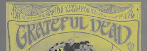
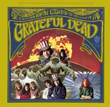
The Grateful Dead font is based on the lettering on the cover of the band’s first album, which came out in 1967 and was called The Grateful Dead. The artist Stanley Mouse created an image of Yoga-Narasimha, a 12th-century avatar of the Hindu god Vishnu, for the album’s cover.
The Grateful Dead Font
1.
Harbing
| Similar GREATEFULL DEAD
Type your own text above to preview fonts in real-time. Adjust Size & Color to find your perfect match.
What font is used on the Grateful Dead album cover?
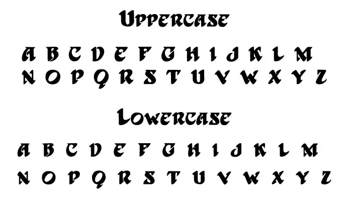
The font used for the band’s name on the album cover is very similar to the Harbinger font. David F. Nalle designed this font for the Scriptorium Font Library in 1994. He took inspiration from the album design for the font. The Harbinger font is free for personal use and can be purchased from the creator.

Fonts, Characters, and Symbols
Best Uses
- Concert posters & band merchandise
- Album artwork for rock/psychedelic bands
- Festival t-shirts & stickers
- Vintage art prints & tattoos
- 1960s-themed party invitations
Quick Tips
- Use only for headlines (hard to read in paragraphs)
- Go big (minimum 24pt)
- High contrast colors
- Pair with simple, clean fonts for body text like GT America
Other fonts besides the Harbinger font, like Naruto, Persona 5, Frozen, and The Beatles Font, can also be used for different projects.
Thanks