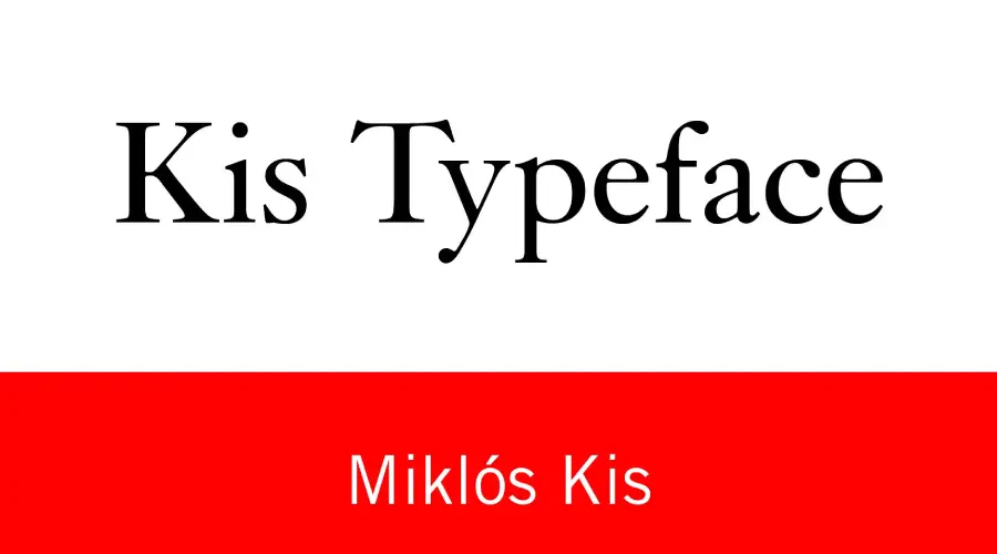
Kis Typeface
Kis typeface was designed by Hungarian punchcutter Nicholas Kis (Miklós Kis) in the late 17th century. It is a serif font from the Dutch old face style, characterized by low contrast, large x-height, and angled stress. In this guide, we will explore the features of the Kis Typeface, its effectiveness, and how to use our Kis Font Generator.
Designing Kis Typeface
Kis typeface was created by Nicholas Kis, born in 1650 in Misztótfalu, Hungary. He learned punchcutting from his father, who was also a printer and typefounder. In 1680, he moved to Amsterdam, where he worked for several printers and publishers. He also traveled to other European cities, such as Paris, London, and Berlin, where he sold his types and learned from other masters.
The Kis typeface is considered one of his finest works and one of the finest examples of the Dutch old-face style. The original matrices of his types were acquired by Stempel in 1919 and have since been revived and digitized by various foundries, including Linotype and Monotype.
About Kis Typeface
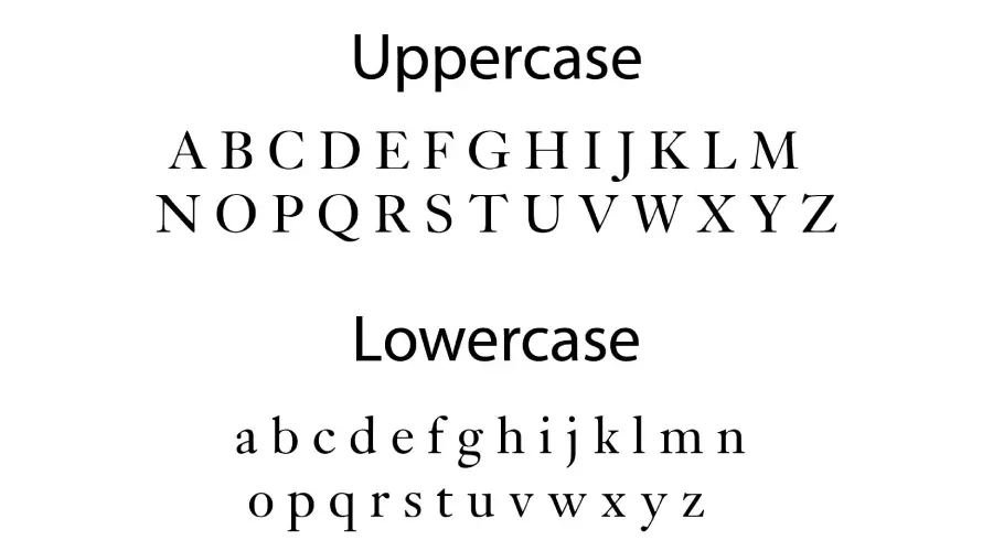
Kis Typeface is a serif font with clean lines and a modern look. It is available in two versions: Kis BT and Kis PT. Kis BT was designed by Nicholas (Miklós) Tótfalusi Kis, while Kis PT, also called Janson, was developed by Chauncey H.Griffith based on Nicholas’s original cut from 1670 to 1690. Cyrillic version was developed at ParaType in 2001 by Vladimir Yefimov.
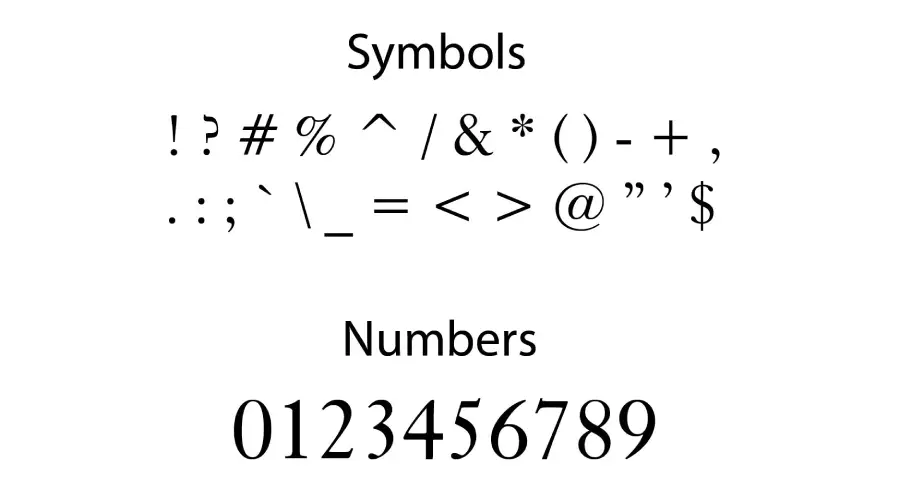
Kis is a transitional serif font characterized by its balanced and harmonious design. It bridges the gap between the old-style typefaces of the Renaissance and the modern typefaces of the 18th century. It has a low contrast between thick and thin strokes, a large x-height that makes it appear taller and more spacious, and an angled stress that gives it a dynamic and lively look. The Kis typeface also has some irregular details and quirky features, such as the curved tail of the Q, the tilted crossbar of the t, and others.
Font Effectiveness
Kis has been praised for its readability and versatility. Its balanced design makes it suitable for both body text and headlines. Ki’s typeface was widely used in Europe in the 17th and 18th centuries, especially for books and newspapers. Many typographers and designers like Stanley Morrison, Jan Tschichold, and Hermann Zapf admired it.
Font View
Kis Font Generator
Our Kis Font Generator and Preview Creator tools allow you to select a font from the dropdown list and live type, adjusting the size, color, and background according to your preferences. The changes can be viewed in real-time, and you can download the generated font preview as an image file. You can also download the font for testing purposes only. There is a reset button for going back to default settings. So, try it now and check out the font for free!
Fonts Similar to Kis Typeface
If you’re a fan of Kis, you might also appreciate these similar fonts:
Conclusion
Kis Typeface is a modern serif font that is perfect for a wide range of uses. Its clean lines and modern look make it ideal for personal and professional projects. We hope this guide has helped explore the features of Kis Typeface, its effectiveness, and how to use our Kis Font Generator. If you have any questions, please ask them below.