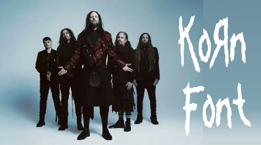
Korn Font is the iconic, childlike lettering of the nu-metal band Korn’s logo, originally hand-drawn by vocalist Jonathan Davis in 1994 with a crayon in under a minute.
Korn Font

Korn
| OriginalSince it’s not a real font, Kornucopia is the official imitation created by Astigmatic One Eye, featuring jagged, horror-themed letters with the signature mirrored “R” (Я). Free for personal use, it requires licensing for commercial projects.
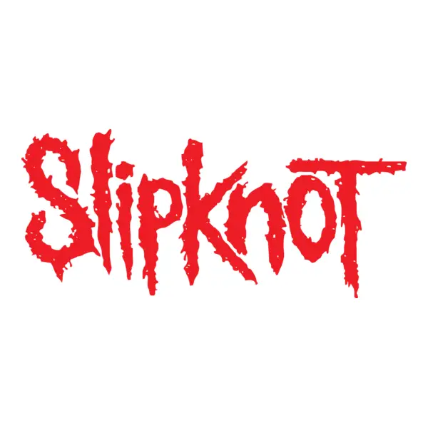
Their logo font also looks similar to Slipknot. Some fans speculate that they use the same font. Korn was one of the pioneers of the nu metal genre, which Slipknot later joined. They both influenced each other, leaving a profound mark on metal songs.
Conclusion
The Korn font is a symbol of more than just a band; it’s a representation of a cultural movement. For fans, designers, and everyone in between, this font is a tool to communicate with boldness and originality.
If you liked this font and are looking for more, check out Chiller, FNAF, and Goosebumps fonts now!
Thank you for reading!