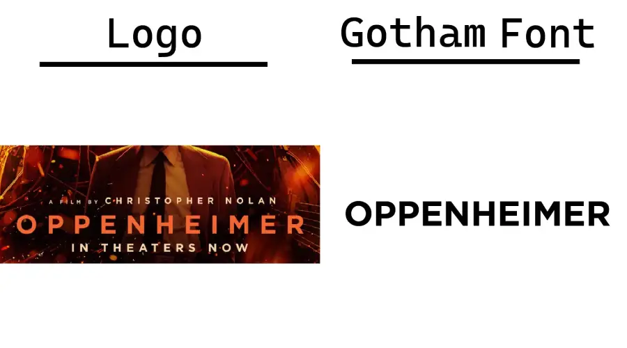
Oppenheimer font refers to the font used for the biographical film directed by Christopher Nolan, chronicling the life of J. Robert Oppenheimer. The movie tells the story of J. Robert Oppenheimer, “the father of the atomic bomb,” the physicist who led the Manhattan Project to develop the bomb. Now let’s talk about Oppenheimer Font and learn where it came from.
What Font Was Used in the Oppenheimer Movie Logo?
Oppenheimer poster font used Gotham Bold for the logo, and it captures the essence of its movie very well. Gotham Bold is a geometric sans-serif typeface part of the Gotham font family, designed by Tobias Frere-Jones and Jesse Ragan in 2000.
Oppenheimer logo uses Gotham Bold as its main font, reflecting the theme and mood of the movie. The movie is a biographical drama about J. Robert Oppenheimer, the physicist who led the atomic bomb development during World War II.

You can create eye-catching titles, logos, posters, and banners with Gotham Bold font. It is suitable for both print and digital media. However, Gotham isn’t a free font. So, you must purchase a license to use the font.
Similar To Oppenheimer Font
Even though Gotham was used to create the Oppenheimer logo poster, it is not a free font. So you can’t use it for designs or commercial projects. But we have some free fonts that you can use. These fonts have the same appearance and vibes as the Gotham. These fonts, Metropolis Bold, Argentum Novus, and Ufiz Uki font. So, let’s learn about them now, and we will also provide a download link.
Metropolis Bold

Metropolis Bold is a geometric sans-serif typeface part of the Metropolis font family, designed by Chris Simpson in 2016. And it looks very similar to the Oppenheimer Poster font. Other popular geometric sans-serif fonts, including Gotham-inspired Metropolis. Metropolis is a free and open-source font. So you can download it for free and use it for both personal and commercial.
Argentum Novus

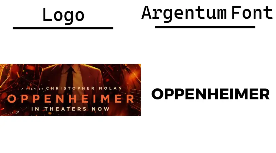
Argentum Novus is similar to the Gotham Bold font and the Oppenheimer logo in a few ways. First, all three fonts are sans-serif fonts. This means that they lack serifs, which are small strokes extending from the letters’ ends. Sans serif fonts are often seen as more modern and minimalist than serif fonts.
Second, Argentum Novus and the Oppenheimer logo have a bold and geometric style. The letters are all straight and angular, with no curves or flourishes. This gives the font a strong look.
UKIJ UFI

UKIJ UFI is a geometric sans-serif typeface part of the UKIJ font family, designed by the Uyghur Computer Science Association (UKIJ) in 2000. UKIJ UFI looks like the Oppenheimer logo, which uses Gotham Bold as its main font. Both fonts have a high contrast between thick and thin strokes and a wide X-height that makes them easy to read. Both fonts have geometric structures, giving them a clean and elegant look. And it is free to download and use. So you can use this font easily for any Oppenheimer-themed project without worry.
Oppenheimer Font Generator
Our Oppenheimer font generator lets you preview different fonts similar to the Oppenheimer font and download them. For your convenience, you can also download a preview of the selected font in PNG format. Try it now and see what you can create.
Suggested Fonts to Explore
After acquainting yourself with the Oppenheimer font, consider broadening your typographic horizons with these suggestions:
- Times New Roman: A timeless classic suitable for a myriad of applications.
- Helvetica: A versatile sans-serif font loved by designers worldwide.
- Arial: A modern typeface that’s perfect for both print and digital media.
- Futura Oblique: A geometric font with a contemporary twist.
- Roboto: A neo-grotesque sans-serif that’s ideal for user interfaces.
Conclusion
Typography is an art, and the Oppenheimer font is a testament to that. Whether you’re a designer, a movie buff, or someone who appreciates the nuances of typefaces, the Oppenheimer font and its alternatives offer a world of possibilities.
For more font inspirations and tools, explore our extensive collection at FontSpark.
