
The Papyrus font is a well-known decorative, calligraphic typeface designed by Chris Costello and released by Letraset (later URW++) in 1982. It became famous for its distinctive “ancient” aesthetic, evoking handwritten textures on papyrus or stone. Despite its popularity, Papyrus is also one of the most criticized fonts in graphic design due to overuse and misuse.
Papyrus font
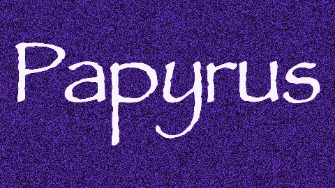
Papyrus
| OriginalMajor Earthquake
| SimilarKey Characteristics
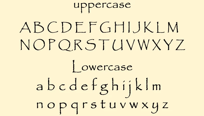
- Style: Rustic, hand-drawn, calligraphic with rough, irregular edges and organic, flowing strokes
- Vibe: Exotic, “ancient,” mystical, or naturalistic, often associated with Egyptian, Middle Eastern, or fantasy themes
- Overused Reputation: Massively popular in the 1990s and 2000s for anything needing an “earthy” or “historical” feel

History and Creation
At age 23, Chris Costello created the Papyrus font while working at an ad agency. He spent six months hand-drawing it in his free time, inspired by ancient texts.
About 10 font companies rejected it, saying it was too delicate for computers. Letraset finally accepted it after he made the letters thicker and added lowercase.
He sold the rights for £750, around $2,400 today. He still gets small royalty payments, even though the font is now on over a billion computers.
Why Papyrus Became Controversial:
- Overuse in Media:
Famously used in Avatar (2009) for subtitles and titles and in The Da Vinci Code book/movie branding. Its ubiquity in “mystical,” “natural,” or “historical” contexts led to fatigue. - Inappropriate Contexts:
Often misapplied (e.g., medical documents, fine dining menus, tech startups), it clashes with its rustic feel. - Design Criticism:
- Uneven stroke weights.
- Awkward spacing/kerning.
- Seen as a “default” choice for amateur designers.
- Memes & Parodies:
Papyrus became a meme (e.g., The Simpsons episode mocking its use on a “Chinese” restaurant sign). Microsoft even added a “Papyrus Condensed” variant in Office, further cementing its notoriety.
License Information
This widely used font is completely free for personal use. There is no need for a license or any other permission for personal use. But one has to buy it for commercial use or get the authorities’ permission. It is good to get complete information on the license of any font before using it.
Similar to the Papyrus font
There are many similar fonts to the Papyrus font, but this one has unique features that make it exceptional. Some similar fonts are
- Major Earthquake
- Karen, etc.
- Ricky and Morty Font
- Film Cryptic
- Plato
- zebra-CROSS
- Pea-Theresa
- Monotonia Display
- Humana Sans ITC
- ITC Tempus Sans
- G&G
- Lithos
Font family
The Papyrus font has only one style, and that is Papyrus Regular.
Font pairing
Papyrus font can go well with the fonts given below:
- Papyrus font + Georgia
- Papyrus font + Victorius Aged Ancient Font
- Papyrus font + Odd Times Script-inspired font
- Papyrus font + Chara Sans Serif & Serif Duo (Clean Papyrus Sans Font)
- Papyrus font + Historia Font (Papyrus Bold Font Script)
- Papyrus font + Scriptease Typeface: Brush Font
Conclusion
Papyrus is an overused decorative font from 1982. Use it sparingly for headings only, never body text. Pair with simple, clean fonts like Georgia. Most designers prefer alternatives.