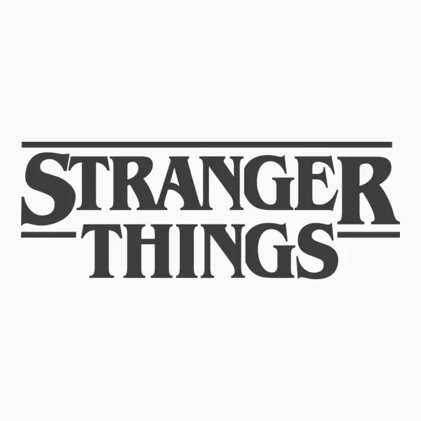
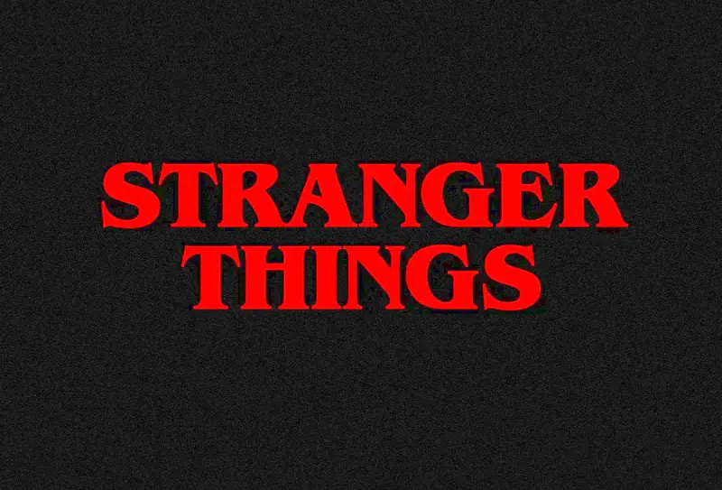
The phrase “the Stranger Things font” refers to the visual identity and branding system of Netflix’s Stranger Things franchise, centred on its iconic use of ITC Benguiat Bold Condensed. While technically just a typeface, it has become synonymous with the show’s entire aesthetic, evoking 1980s supernatural horror, Stephen King paperbacks, and retro science fiction.
Stranger Things font

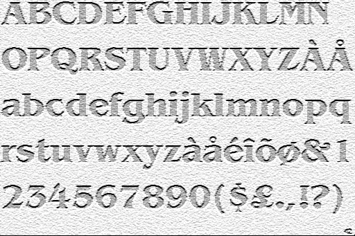
Benguiat Bold
| OriginalStranger Things Outlined
| SimilarThe Font’s Creation (Pre-Stranger Things)
The typeface was designed in 1977 by legendary New York typographer Ed Benguiat for the International Typeface Corporation (ITC). Benguiat, a former jazz percussionist who played with Stan Kenton and Woody Herman, created over 600 typefaces in his career. Art Nouveau letterforms inspired ITC Benguiat and became ubiquitous on 1980s book covers, most notably Stephen King novels, the Choose Your Own Adventure series, and Dungeons & Dragons handbooks.
Why This Font Was Chosen
The Duffers specifically wanted the title sequence to feel like “discovering a forgotten Stephen King novel in a thrift store.” They sent 12 vintage King book covers to design studio Imaginary Forces, all featuring ITC Benguiat. The font’s bold weight, condensed width, and Art Nouveau flair perfectly captured the era’s pulp horror aesthetic.

Font Design Details: ITC Benguiat in the Logo
The Specific Font:
ITC Benguiat Bold Condensed is the exact variant used. Ed Benguiat designed it with:
- Art Nouveau influences (curved letterforms, decorative serifs)
- High x-height for bold impact
- Condensed width to create a tight, imposing wordmark
- Alternate characters (the “S” has a distinctive hook)
Design Process with Imaginary Forces:
- Initial Concepts: Tested typefaces like Cortez, MT Light, and Avant Garde Futura
- “Red” Concept: Chose ITC Benguiat after Netflix’s content agency Contend finalized the logo
- Analog Testing: Printed the logo on kodalith film, colored it with red gel, and shot light through it to capture 1980s optical printing imperfections
- Digital Execution: Animated in Adobe After Effects with scanned 35mm film grain (Gorilla Grain) and real lens flares
- Color Psychology:Red was chosen because it “raises blood pressure” and felt “dangerous and alluring”
- Animation: Letters slide like “puzzle pieces” choreographed to the synth score, symbolizing the show’s mystery-solving theme
Design Elements:
- Film grain & light leaks to mimic 1980s optical printing “happy mistakes”
- Floating letterforms that drift in a black void before snapping together
- Fuzzy edges & color bleeding as intentional artifacts
- Episode title cards use a “fly-through” effect inspired by Bullitt (1968)
Licensing
ITC Benguiat Bold Condensed is not free for personal use. It is commercial software owned by Monotype Imaging, requiring a paid license even for personal projects.
Fan-made alternative
“Stranger Things Outlined” is a fan-made recreation, not an official font. Created anonymously around 2016-2017, shortly after the show’s debut, this free download mimics the logo’s red neon glow and outline effect but is based on the original ITC Benguiat Bold Condensed.
Best Font Pairing for Stranger Things Font
- Avenir: A geometric sans-serif that feels professional yet friendly
- Futura: A classic geometric font that matches the 1980s aesthetic
- Gotham: Clean and versatile, works well for both print and digital
Simple rule: Pair Benguiat’s dramatic flair with a simple, neutral font for the best results.
Conclusion
The Stranger Things font, ITC Benguiat Bold Condensed, turns a 1977 typeface into an iconic logo through red animation and vintage effects. Designed by Ed Benguiat and brought to life by Imaginary Forces, it perfectly captures the show’s 1980s supernatural horror feel, making it one of television’s most recognizable brand marks.
