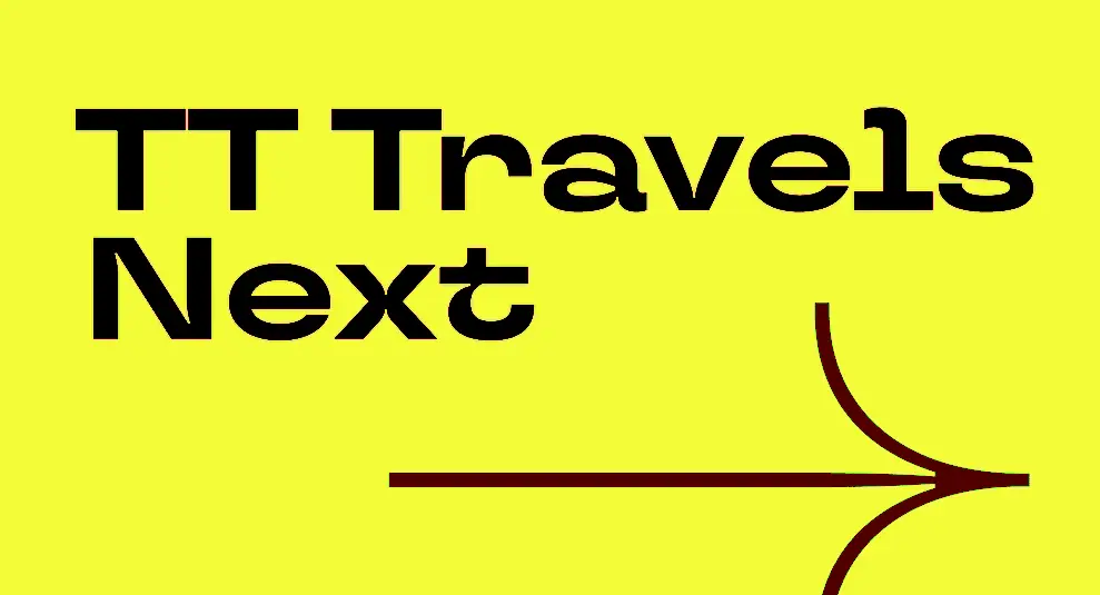
TT Travels Next Font is a modern, wide display font (meaning it’s made for headlines, not body text) created by TypeType Foundry in Russia. TypeType was founded in 2013 by Ivan Gladkikh and Alexander Kudryavtsev.
The font was born in July 2021 after a design conference in Moscow (Mail.ru Design Conf x Dribbble Meetup) in August 2020. The team used the original TT Travels font for the event branding but felt it wasn’t bold enough. They asked, “What if we made it more rebellious and punk?”
TT Travels Next Font Family
Original Trial Fonts
Tt Travels Next Trial Black Italic
| OriginalTt Travels Next Trial Black Outline Italic
| OriginalTt Travels Next Trial Black Outline
| OriginalTt Travels Next Trial Black
| OriginalTt Travels Next Trial Bold Italic
| OriginalTt Travels Next Trial Bold
| OriginalTt Travels Next Trial Demi Bold Italic
| OriginalTt Travels Next Trial Demi Bold
| OriginalTt Travels Next Trial Extra Bold Italic
| OriginalTt Travels Next Trial Extra Bold
| OriginalTt Travels Next Trial Extra Light Italic
| OriginalTt Travels Next Trial Extra Light
| OriginalTt Travels Next Trial Italic
| OriginalTt Travels Next Trial Light Italic
| OriginalTt Travels Next Trial Light
| OriginalTt Travels Next Trial Medium Italic
| OriginalTt Travels Next Trial Medium
| OriginalTt Travels Next Trial Regular
| OriginalTt Travels Next Trial Thin Italic
| OriginalTt Travels Next Trial Thin
| OriginalKey designers:
- Kseniya Karataeva (lead designer, original idea)
- Yulia Gonina (art director)
- Pavel Emelyanov (concept developer)
TT Travels Next Font Family Structure
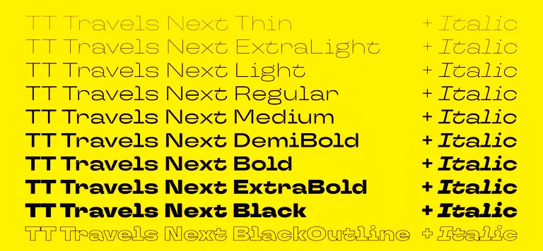
21 styles total:
9 main weights (each comes in regular and italic):
- Thin, ExtraLight, Light, Regular, Medium, DemiBold, Bold, ExtraBold, Black
3 special styles:
- Black Outline (upright)
- Black Outline Italic
- 1 Variable Font (combines everything)
Specs per style:
- 768 characters
- 26 OpenType features (alternates, ligatures, arrows, etc.)
- Supports 190+ languages (Latin and Cyrillic)
Future: No new styles announced as of 2024.
TT Travels Next Font Design Look & Features
Visual Style:
- Very wide letters (almost looks monospaced)
- Tight openings in letters like ‘e’ and ‘a’ (closed aperture)
- Low contrast (consistent thickness)
- Sharp angles mixed with smooth curves
- 14-degree italic slant (steeper than normal for more energy)
- Ink traps (technical cutouts) that are exaggerated for style
- Two outline versions that can stand alone
OpenType Features:
- 6 stylistic alternate sets
- Ligatures, circled numbers, arrows
- Case-sensitive punctuation
- Old-style numbers
Variable Font:
- Weight: 100 to 900
- Slant: 0 to 14 degrees
TT Travels Next Font
Best Uses
TT Travels Next is a display font (not for body text). It works best for:
Perfect For:
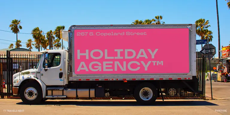
- Logo design – Bold and memorable brand marks
- Headlines & titles – Magazine covers, posters, website headers
- Editorial design – Large text in magazines, lookbooks, brochures
- Web graphics – Hero sections, banners, social media posts
- Merchandise – T-shirts, stickers, posters, souvenirs
- Advertising – Billboards, digital ads, video overlays
- Accent text – Short phrases or impactful statements
Not For:
- Long paragraphs, books, or any body text (too wide and tight to read comfortably)
License
Yes, the trial version is free for personal use.
- ✅ Personal projects (school work, hobbies, personal websites, non-commercial designs) are allowed with the trial version
- ❌ Commercial projects (client work, products for sale, business branding, advertising) require a paid license
Fun Facts You Didn’t Know
- Born at a conference: The idea came directly from event branding needs.
- Fake monospacing: The wide style is so consistent that designers often think it’s a monospace font (it’s not).
- Over-the-top ink traps: The technical cutouts are intentionally bigger than needed just for looks.
- 14-degree secret: The italic angle was specifically chosen to feel aggressive and editorial.
- Hidden creator: Pavel Emelyanov (the concept guy) helped create many popular TypeType fonts but rarely gets credit.
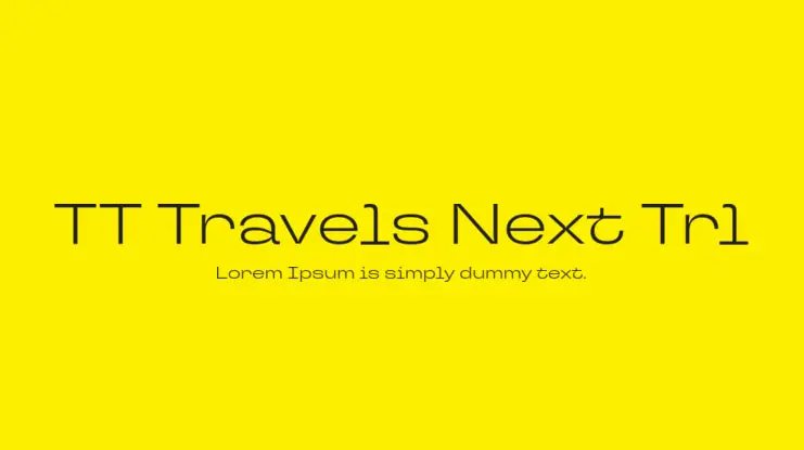
- Trial watermark: Free versions add “Trl” to the name to stop commercial use.
- Big team: Over 10 specialists worked on it, including a dedicated hinting expert.
- Outline fonts are solo artists: The outline styles were designed to work by themselves, not just as companions.
- Language overload: Despite its trendy look, it supports 190+ languages, including rare Cyrillic scripts.
- Punk philosophy: The design brief literally said, “Reject conformity and compromise.”
Summary
TT Travels Next Font is a 21-style bold display font from TypeType (released July 2021) that reimagines its predecessor as a “rebellious punk.” It features ultra-wide letters, tight openings, exaggerated ink traps, and a steep 14-degree italic. It includes 9 weights with italics, 2 outline styles, a variable font, 757 characters per style, and support for 190+ languages. Perfect for modern branding, posters, and headlines but not for body text.
By the way, if you’re interested in any of these fonts for your own projects, you might also want to check out the Star Wars font or Rae Dunn font
FAQ
Q: Who made it? A: TypeType Foundry (Kseniya Karataeva and Yulia Gonina led the design).
Q: What’s the difference from regular TT Travels? A: TT Travels Next is wider, bolder, and more “punk,” like a rebellious version of the original.
Q: How many styles? A: 21 total: 9 weights (regular + italic), 2 outlines, and 1 variable font.
Q: Can I use it for free? A: Only the trial version for personal testing. Commercial use requires a license ($42.99/style or $349/full) or an Adobe Fonts subscription.
Q: What’s special about the italics? A: They slant at 14 degrees instead of the usual 12 degrees, making them feel faster and more dynamic.
Q: Does it support my language? A: Probably 190+ languages, including Latin and Cyrillic scripts.
Q: Can I use it for body text? A: No, it’s designed for headlines and display use only; it’s too wide and tight for reading.
Q: Are the outline styles just extras? A: No, they were designed to work as standalone fonts, not just add-ons.
Q: What are “ink traps”? A: Little cutouts at letter joints that are usually functional but here are exaggerated for style.
Q: Will there be more styles? A: Not announced yet; 21 styles is the complete family for now.