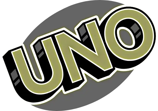
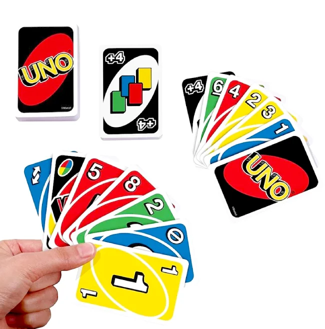
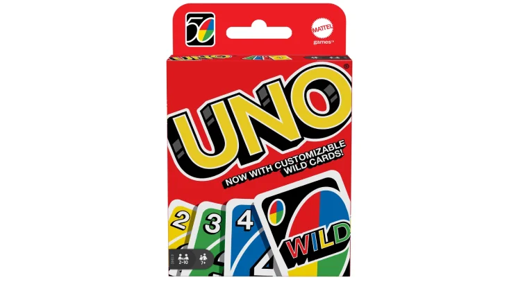
UNO Font is the typography used on cards from the UNO card game, created in 1971 by Merle Robbins and currently owned by Mattel.
UNO Font

Arial Bold
| SimilarCabin Bold
| ReplicaCabin Condensed Bold
| SimilarHelvetica Neue 97 Black Condensed Oblique
| SimilarThe UNO card game uses different fonts for its logo and the text on the cards themselves:
UNO Logo Font
The iconic slanted UNO wordmark is custom-lettered and not a standard font. However, the closest commercial match is:
- Arial Bold (designed by Patricia Saunders and Robin Nicholas)

Arial Bold

The UNO logo is custom lettered, and while the closest font to the wordmark is Arial Bold, designed by Patricia Saunders and Robin Nicholas.
Free Alternative: Cabin Bold – an open-source sans serif by Pablo Impallari that closely captures the logo’s style and is available on Google Fonts.
Cabin Bold

Cabin Bold, designed by Pablo Impallari, is a free alternative that captures the essence of the UNO logo’s style. Cabin Bold is available in four weights with matching oblique styles, offering versatility for various design needs. It’s also available on Google Font Library.
Card Text Font
The numbers and action text printed on UNO cards are used:
- Helvetica Neue 97 Black Condensed Oblique (originally designed by Max Miedinger and Eduard Hoffmann)
Helvetica Neue 97 Black Condensed Oblique

For the font used on the cards, the specific typeface is Helvetica Neue 97 Black Condensed Oblique. This font was originally designed by Max Miedinger with Edüard Hoffmann and is known for its clean, modern aesthetic, which contributes to the cards’ readability and overall design.
2020 Redesign
In January 2020, Mattel introduced a minimalist redesign by Warleson Oliveira that explicitly uses Helvetica for a cleaner, more modern look across all card elements.
The typography of UNO is as integral to its identity as the game’s rules and gameplay. Whether you’re a designer looking to capture the essence of UNO in your work or a fan curious about the game’s visual identity, the fonts associated with UNO offer a fascinating glimpse into the intersection of design and entertainment.
Got a thing for this font? Our offerings, like Nerf, Disneyland, and Rolex, will intrigue you further.
Thanks.
