The Marvel logo Font is taken from The Marvel logo. It is the large red “MARVEL” word that appears at the beginning of every Marvel movie. It’s just the company name written in bold, comic-book-style red letters on a white background, sometimes accompanied by flipping comic pages.
Marvel is a company that makes up superhero stories.
It started as a comic-book publisher (think thin magazines with pictures) and now also produces movies, TV shows, and games. The heroes you might know, Spider-Man, Iron Man, the Avengers, Black Panther, and the X-Men, are all characters Marvel created.
The primary Marvel wordmark is a custom, proprietary design, not a readily available retail font, engineered by Tobias Frere-Jones and Cyrus Highsmith to maximize block-like density and institutional strength. “Marvel Regular” is a free fan font made in 2019 by YbtFonts. It copies the tight Marvel letters, skips the red box, and you can grab it for personal use.
In 2002, two letter artists, Cyrus Highsmith and Tobias Frere-Jones, drew this special set of shapes from scratch (they started with a font called Benton Sans Extra-Condensed Black, then redrew every letter so it felt punchy and heroic). Because it’s hand-tuned, you can’t just download it; it’s Marvel’s own “super-suit” for its name.
Marvel Logo Font
BentonSans Comp Black Regular
| OriginalFakt soft pro
| OriginalMarvel Regular
| ReplicaThe Logo, designed in 2002, received a crucial and subtle update around 2012 by British graphic designer and typographer Rian Hughes. Hughes, renowned for creating numerous iconic logos for both Marvel and DC, brought in Batman, the X-Men, and Spider-Man to refine the design. This refinement was necessary to “achieve greater harmony” and correct subtle optical flaws that would become visible when the Logo was scaled dramatically for cinematic motion graphics on high-resolution screens.
The Two-Font Strategy: The Logo vs. the Everyday Font
Here’s a behind-the-scenes secret: Marvel actually uses two different fonts for different jobs.
- The Logo (based on Benton Sans Extra Comp Black): This is the bold icon used on movie posters, comic books, and toys. Its job is to look tough and cool.
- The Everyday Font (Fakt Soft Pro): This is the font you’ll see on the Marvel App, in their emails, and on their website. It’s described as “soft and friendly, yet plain enough to stay out of the way.” It’s the simple, easy-to-read font that helps you use the site or app without distraction.
This demonstrates a well-planned branding strategy: one font for the powerhouse logo and another for the friendly, helpful side of the company.
How the Marvel Logo Has Changed
Marvel’s Logo has changed more times than a movie star. Marvel’s Logo keeps changing because the company continues to grow. The newest version stuck around simply because it finally feels right, bold, timeless, and unmistakably Marvel.
From 1939 to 1951, Marvel (then known as Timely Comics) used a red, white, and blue shield that resembled Captain America’s own shield, as the country was in a patriotic mood and the company sought to identify with the home-team heroes. In the early 1960s, they dropped the shield and attempted to stack the letters “M” and “C” on top of each other, hoping the shorter mark would help them compete with DC Comics for shelf space. However, fans barely noticed, and the idea soon faded. During the 1990s, the Logo went full MTV: a giant red “M” with the word “Comics” punched out in loud yellow on top, a look that felt rebellious and flashy, fitting the extreme style of the decade. Finally, in 2002, the studio unveiled the simple red-box logo with thick white “MARVEL” inside a bright red rectangle, which first appeared on the X-Men movie poster. It was clean, powerful, and instantly loved, so it has remained on everything from comic covers to lunchboxes ever since.
It’s not just a neat animation; it’s a short story. It serves as a symbolic handoff from the company’s comic-book past to its movie present, providing fans with an instant emotional connection.
The Flipbook: A Love Letter to the Fans
The most famous use of the modern Logo is the short “flipbook” clip that plays before every MCU film. Created by Imaginary Forces, it transitions through hundreds of comic panels and movie clips before transforming into the solid 3D Marvel logo.
Merch, Games & Books, the Font Keeps Travelling
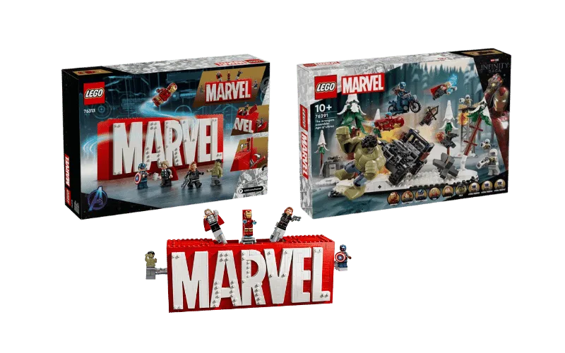
Lego Marvel boxes – red block foil-stamped, with a minimum width of 18 mm so that kids can read them under store lights.
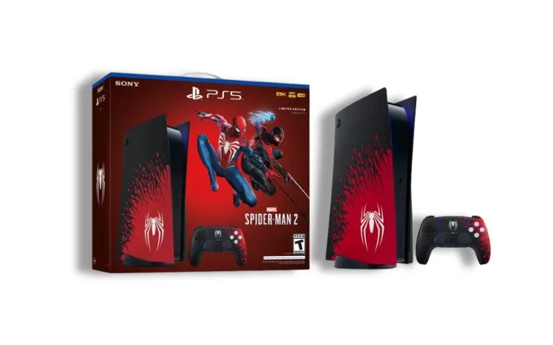
Marvel’s Spider-Man 2 (PS5) – menu headers use Benton Sans Compressed; body copy switches to Helvetica Neue LT Std.
Scholastic early-reader books – cover logo is the official vector; interior titles switch to Comicraft’s Mighty family for fun.
Hasbro figure blister cards – the rectangle is embossed and features a gloss UV finish, giving a tactile pop when you run a finger across it.
Future-Proofing the Rectangle
- The 2025 style-bible update already includes a dark-mode variant: a white rectangle with red letters and 85% opacity for streaming menus.
- A variable-font experiment (leaked in 2023) allows the rectangle to stretch to full CinemaScope width, then snap back. IMAX engineers call it “Elastic Marvel,” while the fandom refers to it as “the rubber stamp.”
Fun Facts
- Here’s a remarkable, little-known fact: a lot of the letters in “MARVEL” are slightly linked, almost like they’re holding hands. But look closely, the last “L” stands alone. It’s a tiny, planned design choice that makes the whole thing special.
- A villain named Typeface? Yep, there’s a Marvel character called Typeface, a sign-maker who turns bad guy and uses giant letter-shaped weapons. He even has a big red “R” on his forehead!
- The Legal Fights: That red “MARVEL” isn’t just a typeface, it’s a vault key. Disney’s courtroom battles with creators’ heirs demonstrate that the company is willing to spend millions to maintain control over every aspect of the brand, including the shape of six letters, within its universe.
Conclusion
So, the red “MARVEL” isn’t a font, it’s a portal: step through the kerned-white threshold and you’re instantly inside Marvel’s 85-year, multi-billion-dollar, single-panel universe.