
The Philadelphia Phillies font is a custom cursive typeface.
The Philadelphia Phillies are a professional baseball team based in Philadelphia, Pennsylvania. They compete in Major League Baseball (MLB) as a member club of the National League East division. The Philadelphia Phillies have had several logos throughout their history and have also gone through several rebrandings over the years. Below, we are showing the logos and similar fonts.
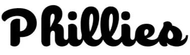
Philadelphia Phillies Font
Mlb philadelphia Phillies1980
| SimilarLogo from 1970 to 1991
The Philadelphia Phillies went through several changes to their logo from 1970 to 1991. Most variations featured a stylized letter “P” as the main element, including: a red “P” with a white baseball in the center (1970–1975); an image of two children dressed in colonial blue robes (1976–1980); a red “P” with a baseball in the middle (1981); and a brown “P” (1982–1991). The team was experimenting with different variations of logos, but mostly using the stylized letter “P” as a representation of the team’s name.
Similar Font
There is a font called “MLB Philadelphia Phillies 1980” that was designed by Twisted Gnome Productions, but it is not officially associated with the team. This font is based on the team’s overall logo and style during the period from 1970 to 1991, but it might not match the exact style of the logos used during that era. It’s an inspired font that can be used for personal projects and designs.
Logo from 1992 to Today
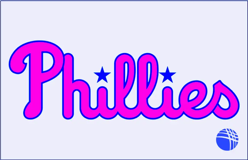
From 1992 to 2018, the team featured a blue background with a red contour and a white silhouette of the Liberty Bell in the center, with the team’s name “Phillies” written in red and blue stars adorning the letter “i.” In 2019, the team introduced a new, simple logo that featured only the team’s name, “Phillies,” and a Liberty Bell in the background. This design choice reflects the national spirit of the team and its roots, emphasizing continuity with the past and confidence in the future, with a particular emphasis on the two blue stars that replace the dots on the letters “i” and an effective design of the letters “ll.” The most common thing in these logos is the word “Phillies,” which is the same as the previous ones.
Similar Font
From 1992 to today, the team’s logo has been custom-made, and there is no official font used by the team. However, some fonts are similar to the word “Phillies” used in their current logo. Like;
1. Robu Choco Script Semi Bold by Typeverything – Check the Font
2. Mulberry Road Cond by Jonahfonts – Check the font
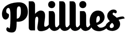
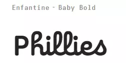
3. Enfantine Font has a somewhat similar lowercase – Check the font
Best Pairing Fonts
Gotham Font (Best Overall): Why it’s perfect: Gotham is a geometric sans-serif font widely used in MLB team branding. It’s clean, modern, and creates excellent balance with script fonts.
Trade Gothic Font: Why it’s perfect: Extremely popular in sports design as a condensed sans-serif. Ideal for jersey numbers and secondary text.
Athletic Font: Why it’s perfect: Sports-themed by name and design. Block-style athletic font that reinforces baseball’s traditional look.
Avenir Font: Why it’s perfect: Similar to Gotham but with a more humanistic touch. Works for both headlines and body text.
Conclusion
The Philadelphia Phillies font is a proprietary MLB creation unavailable for public use. For personal projects, replica fonts like “MLB Phillies” or commercial alternatives such as URW’s “Philly Sport Script” best capture the iconic star-dotted cursive script.